" height="20.604px" id="LQwnPTzJR" transform="translate(136.916 2.424)" width="20.720199999999977px"/><path d="M 0 10.302 C 0 4.612 4.638 0 10.36 0 C 16.082 0 20.72 4.612 20.72 10.302 C 20.72 15.992 16.082 20.604 10.36 20.604 C 4.638 20.604 0 15.992 0 10.302 Z" fill="rgb(85, 59, 139)" height="20.604000000000013px" id="F7VA_fV_V" transform="translate(0 85.244)" width="20.7202px"/><path d="M 0 5.05 C 0 2.261 2.274 0 5.078 0 C 7.883 0 10.157 2.261 10.157 5.05 C 10.157 7.839 7.883 10.1 5.078 10.1 C 2.274 10.1 0 7.839 0 5.05 Z" fill="rgb(129, 62, 152)" height="10.099979999999988px" id="j_FfixfkP" transform="translate(23.158 103.02)" width="10.156979999999997px"/><path d="M 0 5.05 C 0 2.261 2.274 0 5.078 0 C 7.883 0 10.157 2.261 10.157 5.05 C 10.157 7.839 7.883 10.1 5.078 10.1 C 2.274 10.1 0 7.839 0 5.05 Z" fill="rgb(247, 152, 39)" height="10.09998px" id="X5PxjnWxR" transform="translate(121.478 0)" width="10.156980000000004px"/><path d="M 0 58.782 C 0 26.318 26.466 0 59.114 0 C 91.761 0 118.227 26.318 118.227 58.782 C 118.227 91.246 91.761 117.564 59.114 117.564 C 26.466 117.564 0 91.246 0 58.782 Z" fill="rgb(247, 153, 39)" height="117.56380000000001px" id="IvQ1jyat1" transform="translate(25.189 4.242)" width="118.22720000000001px"/><path d="M 36.769 0 C 69.416 0 95.882 26.317 95.883 58.782 C 95.883 91.246 69.416 117.564 36.769 117.564 C 35.474 117.564 34.189 117.521 32.914 117.44 C 13.117 104.795 0 82.706 0 57.57 C 0 34.217 11.322 13.492 28.806 0.529 C 31.41 0.181 34.068 0 36.769 0 Z" fill="rgb(244, 128, 38)" height="117.56406px" id="KBmlKQJOg" transform="translate(47.534 4.242)" width="95.8828px"/><path d="M 44.088 0 C 56.531 10.776 64.396 26.646 64.396 44.342 C 64.396 75.224 40.446 100.543 10.009 102.938 C 3.649 92.214 0 79.711 0 66.361 C 0 36.569 18.168 10.995 44.088 0 Z" fill="rgb(129, 62, 152)" height="102.9384px" id="aGiQBg8j6" transform="translate(79.021 18.682)" width="64.39580000000001px"/><path d="M 43.285 0 C 43.542 2.224 43.675 4.485 43.675 6.777 C 43.675 33.563 25.656 56.163 1.014 63.249 C 0.352 59.879 0 56.396 0 52.833 C 0 26.777 18.581 5.038 43.285 0 Z" fill="rgb(85, 59, 139)" height="63.249199999999995px" id="AGg6oLSgK" transform="translate(99.742 56.247)" width="43.6755px"/><path d="M 0 37.774 C 0 16.912 17.007 0 37.987 0 C 58.967 0 75.974 16.912 75.974 37.774 C 75.974 58.636 58.967 75.548 37.987 75.548 C 17.007 75.548 0 58.636 0 37.774 Z" fill="rgb(255, 255, 255)" height="75.5478px" id="eEqpbsEW6" transform="translate(46.316 25.048)" width="75.9742px"/><path d="M 8.573 0.633 L 16.225 0.633 L 15.073 4.113 L 15.179 4.113 C 15.593 3.621 16.114 3.129 16.741 2.637 C 17.367 2.144 18.054 1.705 18.802 1.318 C 19.55 0.932 20.373 0.615 21.271 0.369 C 22.169 0.123 23.096 0 24.052 0 C 25.859 0 27.346 0.369 28.514 1.107 C 29.682 1.846 30.343 3.006 30.498 4.588 C 31.986 2.935 33.499 1.758 35.034 1.055 C 36.569 0.352 38.294 0 40.206 0 C 41.942 0 43.303 0.29 44.289 0.87 C 45.275 1.45 45.954 2.241 46.327 3.243 C 46.7 4.245 46.809 5.423 46.653 6.776 C 46.498 8.129 46.164 9.579 45.652 11.126 L 40.598 26.26 L 32.627 26.26 L 37.587 11.337 C 37.996 10.142 38.089 9.114 37.866 8.252 C 37.643 7.391 36.876 6.961 35.565 6.961 C 34.644 6.961 33.827 7.11 33.114 7.409 C 32.4 7.708 31.762 8.12 31.2 8.648 C 30.637 9.175 30.164 9.79 29.78 10.493 C 29.396 11.197 29.076 11.935 28.82 12.708 L 24.284 26.26 L 16.313 26.26 L 20.849 12.708 C 21.008 12.251 21.179 11.689 21.362 11.021 C 21.544 10.353 21.631 9.72 21.623 9.122 C 21.614 8.525 21.438 8.015 21.095 7.593 C 20.752 7.171 20.119 6.961 19.198 6.961 C 18.171 6.961 17.276 7.145 16.514 7.514 C 15.752 7.883 15.099 8.375 14.554 8.991 C 14.01 9.606 13.557 10.3 13.195 11.074 C 12.833 11.847 12.517 12.655 12.247 13.499 L 7.971 26.26 L 0 26.26 Z" fill="rgb(85, 59, 139)" height="26.259999999999998px" id="n9Nltb_o9" transform="translate(60.942 49.692)" width="46.7220009933171px"/><path d="M 54.303 0 C 58.316 0 61.437 1.07 63.666 3.21 C 65.94 5.305 67.077 8.248 67.077 12.037 C 67.077 13.196 66.943 14.489 66.676 15.916 L 62.797 37.717 L 51.428 37.717 L 55.039 17.454 C 55.128 17.008 55.173 16.406 55.173 15.649 C 55.173 13.776 54.638 12.349 53.568 11.369 C 52.542 10.388 51.093 9.897 49.221 9.897 C 46.992 9.897 45.119 10.566 43.603 11.904 C 42.087 13.196 41.129 15.047 40.728 17.454 L 37.116 37.717 L 25.747 37.717 L 29.359 17.454 C 29.448 17.008 29.492 16.406 29.492 15.649 C 29.492 13.776 28.957 12.349 27.887 11.369 C 26.862 10.388 25.413 9.897 23.54 9.897 C 21.311 9.897 19.439 10.566 17.923 11.904 C 16.407 13.196 15.448 15.047 15.047 17.454 L 15.047 17.12 L 11.436 37.717 L 0 37.717 L 6.554 0.401 L 17.99 0.401 L 17.187 5.149 C 18.614 3.544 20.33 2.296 22.337 1.404 C 24.388 0.468 26.594 0 28.957 0 C 31.811 0 34.218 0.602 36.18 1.806 C 38.186 3.009 39.613 4.748 40.46 7.022 C 42.11 4.926 44.161 3.232 46.613 1.939 C 49.065 0.646 51.628 0 54.303 0 Z" fill="rgb(85, 59, 139)" height="37.7168px" id="T5SOUejoi" transform="translate(510.6 50.652)" width="67.077px"/><path d="M 41.33 0 L 34.776 37.316 L 23.34 37.316 L 24.209 32.233 C 22.738 33.883 20.933 35.22 18.793 36.246 C 16.697 37.226 14.446 37.717 12.038 37.717 C 8.293 37.717 5.35 36.669 3.21 34.574 C 1.07 32.434 0 29.469 0 25.68 C 0 24.253 0.112 22.96 0.335 21.801 L 4.214 0 L 15.582 0 L 12.038 20.263 C 11.904 20.976 11.837 21.667 11.837 22.336 C 11.837 24.208 12.35 25.657 13.376 26.683 C 14.446 27.664 15.917 28.154 17.789 28.154 C 19.929 28.154 21.735 27.53 23.206 26.281 C 24.722 24.989 25.725 23.161 26.216 20.798 L 29.894 0 Z" fill="rgb(85, 59, 139)" height="37.7168px" id="jD2XysddU" transform="translate(467.61 51.053)" width="41.329999999999984px"/><path d="M 13.308 33.571 C 13.263 33.794 13.241 34.083 13.241 34.44 C 13.241 35.242 13.464 35.822 13.91 36.179 C 14.4 36.535 15.181 36.714 16.251 36.714 L 20.33 36.714 L 18.591 46.41 L 12.773 46.41 C 5.283 46.41 1.538 43.267 1.538 36.981 C 1.538 36.045 1.649 34.864 1.872 33.437 L 4.547 18.591 L 0 18.591 L 1.672 9.095 L 6.219 9.095 L 7.824 0 L 19.26 0 L 17.655 9.095 L 25.145 9.095 L 23.473 18.591 L 15.983 18.591 Z" fill="rgb(85, 59, 139)" height="46.410399999999996px" id="EFUo0Wd14" transform="translate(440.576 41.959)" width="25.144999999999982px"/><path d="M 29.358 0 C 33.103 0 36.046 1.048 38.186 3.143 C 40.326 5.238 41.396 8.159 41.396 11.904 C 41.396 13.152 41.262 14.489 40.995 15.916 L 37.116 37.717 L 25.747 37.717 L 29.358 17.454 C 29.492 16.696 29.559 16.027 29.559 15.448 C 29.559 13.575 29.024 12.126 27.954 11.101 C 26.928 10.076 25.479 9.563 23.607 9.563 C 21.378 9.563 19.505 10.254 17.989 11.636 C 16.473 13.018 15.493 14.957 15.047 17.454 L 15.047 17.12 L 11.435 37.717 L 0 37.717 L 6.554 0.401 L 17.989 0.401 L 17.12 5.417 C 18.591 3.767 20.375 2.452 22.47 1.471 C 24.61 0.49 26.906 0 29.358 0 Z" fill="rgb(85, 59, 139)" height="37.7168px" id="fexvZVjIp" transform="translate(393.306 50.652)" width="41.396000000000015px"/><path d="M 22.604 0 C 27.419 0 31.231 1.315 34.04 3.946 C 36.893 6.531 38.32 10.076 38.32 14.578 C 38.32 16.05 38.208 17.365 37.985 18.524 C 37.807 19.549 37.539 20.642 37.183 21.801 L 11.302 21.801 C 11.257 22.068 11.235 22.492 11.235 23.071 C 11.235 25.033 11.77 26.527 12.84 27.552 C 13.91 28.577 15.337 29.09 17.12 29.09 C 19.973 29.09 22.158 27.886 23.674 25.479 L 35.845 25.479 C 34.24 29.268 31.632 32.367 28.021 34.774 C 24.409 37.182 20.352 38.386 15.849 38.386 C 11.034 38.386 7.178 37.048 4.28 34.373 C 1.426 31.698 0 28.065 0 23.473 C 0 22.091 0.133 20.664 0.401 19.193 C 1.07 15.314 2.452 11.926 4.547 9.028 C 6.643 6.13 9.251 3.901 12.372 2.341 C 15.493 0.78 18.903 0 22.604 0 Z M 26.75 15.983 C 26.839 15.359 26.884 14.935 26.884 14.712 C 26.884 12.929 26.327 11.569 25.212 10.633 C 24.097 9.652 22.626 9.162 20.798 9.162 C 18.836 9.162 17.098 9.764 15.582 10.967 C 14.11 12.127 13.04 13.798 12.372 15.983 Z" fill="rgb(85, 59, 139)" height="38.38559999999999px" id="baLM0_ZEc" transform="translate(352.765 50.518)" width="38.31999999999999px"/><path d="M 54.303 0 C 58.315 0 61.436 1.07 63.666 3.21 C 65.939 5.305 67.076 8.248 67.076 12.037 C 67.076 13.196 66.942 14.489 66.675 15.916 L 62.796 37.717 L 51.427 37.717 L 55.039 17.454 C 55.128 17.008 55.172 16.406 55.172 15.649 C 55.172 13.776 54.637 12.349 53.567 11.369 C 52.542 10.388 51.093 9.897 49.22 9.897 C 46.991 9.897 45.119 10.566 43.603 11.904 C 42.087 13.196 41.128 15.047 40.727 17.454 L 37.116 37.717 L 25.747 37.717 L 29.358 17.454 C 29.447 17.008 29.492 16.406 29.492 15.649 C 29.492 13.776 28.957 12.349 27.887 11.369 C 26.861 10.388 25.412 9.897 23.54 9.897 C 21.311 9.897 19.438 10.566 17.922 11.904 C 16.406 13.196 15.448 15.047 15.047 17.454 L 15.047 17.12 L 11.435 37.717 L 0 37.717 L 6.553 0.401 L 17.989 0.401 L 17.187 5.149 C 18.613 3.544 20.33 2.296 22.336 1.404 C 24.387 0.468 26.594 0 28.957 0 C 31.81 0 34.218 0.602 36.179 1.806 C 38.186 3.009 39.612 4.748 40.46 7.022 C 42.109 4.926 44.16 3.232 46.612 1.939 C 49.064 0.646 51.628 0 54.303 0 Z" fill="rgb(85, 59, 139)" height="37.7168px" id="GmoOfjT4R" transform="translate(281.302 50.652)" width="67.07599999999996px"/><path d="M 16.385 38.386 C 13.175 38.386 10.321 37.739 7.824 36.446 C 5.328 35.153 3.388 33.325 2.006 30.963 C 0.669 28.6 0 25.858 0 22.737 C 0 18.502 1.003 14.645 3.009 11.168 C 5.016 7.69 7.78 4.971 11.302 3.009 C 14.824 1.003 18.748 0 23.072 0 C 26.282 0 29.136 0.669 31.632 2.006 C 34.174 3.299 36.135 5.127 37.517 7.49 C 38.899 9.853 39.591 12.595 39.591 15.715 C 39.591 19.995 38.565 23.874 36.514 27.351 C 34.508 30.784 31.721 33.481 28.155 35.443 C 24.633 37.405 20.709 38.386 16.385 38.386 Z M 17.99 28.555 C 19.862 28.555 21.534 27.998 23.005 26.883 C 24.521 25.724 25.68 24.253 26.483 22.47 C 27.33 20.642 27.753 18.747 27.753 16.785 C 27.753 14.556 27.152 12.84 25.948 11.636 C 24.744 10.432 23.228 9.83 21.4 9.83 C 19.483 9.83 17.789 10.41 16.318 11.569 C 14.891 12.684 13.776 14.155 12.974 15.983 C 12.171 17.811 11.77 19.728 11.77 21.734 C 11.77 23.918 12.35 25.613 13.509 26.816 C 14.668 27.975 16.162 28.555 17.99 28.555 Z" fill="rgb(85, 59, 139)" height="38.38559999999999px" id="rnBWZ5Hba" transform="translate(239.389 50.518)" width="39.59100000000001px"/><path d="M 54.303 0 C 58.316 0 61.437 1.07 63.666 3.21 C 65.94 5.305 67.076 8.248 67.076 12.037 C 67.076 13.196 66.943 14.489 66.675 15.916 L 62.796 37.717 L 51.427 37.717 L 55.039 17.454 C 55.128 17.008 55.173 16.406 55.173 15.649 C 55.173 13.776 54.638 12.349 53.567 11.369 C 52.542 10.388 51.093 9.897 49.221 9.897 C 46.991 9.897 45.119 10.566 43.603 11.904 C 42.087 13.196 41.129 15.047 40.727 17.454 L 37.116 37.717 L 25.747 37.717 L 29.358 17.454 C 29.448 17.008 29.492 16.406 29.492 15.649 C 29.492 13.776 28.957 12.349 27.887 11.369 C 26.862 10.388 25.413 9.897 23.54 9.897 C 21.311 9.897 19.438 10.566 17.923 11.904 C 16.407 13.196 15.448 15.047 15.047 17.454 L 15.047 17.12 L 11.436 37.717 L 0 37.717 L 6.554 0.401 L 17.989 0.401 L 17.187 5.149 C 18.614 3.544 20.33 2.296 22.336 1.404 C 24.387 0.468 26.594 0 28.957 0 C 31.81 0 34.218 0.602 36.18 1.806 C 38.186 3.009 39.613 4.748 40.46 7.022 C 42.109 4.926 44.16 3.232 46.612 1.939 C 49.064 0.646 51.628 0 54.303 0 Z" fill="rgb(85, 59, 139)" height="37.7168px" id="mU2X5N1nV" transform="translate(167.926 50.652)" width="67.07600000000002px"/><path d="M 20.918 0 C 23.04 0 24.639 0.556 25.717 1.67 C 26.795 2.771 27.334 4.547 27.334 6.996 L 27.334 19.617 L 24.452 19.617 L 24.452 7.137 C 24.452 5.578 24.112 4.412 23.432 3.638 C 22.764 2.853 21.768 2.461 20.444 2.461 C 18.581 2.461 17.227 3 16.383 4.078 C 15.54 5.156 15.118 6.744 15.118 8.842 L 15.118 19.617 L 12.217 19.617 L 12.217 7.137 C 12.217 6.094 12.065 5.226 11.76 4.535 C 11.467 3.844 11.022 3.328 10.424 2.988 C 9.838 2.637 9.094 2.461 8.192 2.461 C 6.915 2.461 5.889 2.724 5.116 3.252 C 4.342 3.779 3.78 4.564 3.428 5.607 C 3.088 6.638 2.918 7.91 2.918 9.422 L 2.918 19.617 L 0 19.617 L 0 0.351 L 2.356 0.351 L 2.795 3.076 L 2.954 3.076 C 3.34 2.408 3.827 1.846 4.413 1.388 C 4.999 0.931 5.655 0.586 6.381 0.351 C 7.108 0.117 7.881 0 8.702 0 C 10.166 0 11.391 0.275 12.375 0.826 C 13.372 1.365 14.092 2.191 14.538 3.305 L 14.696 3.305 C 15.329 2.191 16.196 1.365 17.297 0.826 C 18.399 0.275 19.606 0 20.918 0 Z" fill="rgb(85, 59, 139)" height="19.617000000000004px" id="vGSSUmrrh" transform="translate(379.646 126.383)" width="27.334000000000003px"/><path d="M 8.491 0 C 10.131 0 11.537 0.363 12.709 1.09 C 13.881 1.816 14.778 2.836 15.399 4.148 C 16.02 5.449 16.33 6.972 16.33 8.719 L 16.33 10.529 L 3.024 10.529 C 3.059 12.791 3.621 14.513 4.711 15.697 C 5.801 16.881 7.336 17.472 9.317 17.472 C 10.536 17.472 11.614 17.361 12.551 17.138 C 13.489 16.916 14.461 16.588 15.469 16.154 L 15.469 18.721 C 14.496 19.154 13.53 19.471 12.569 19.67 C 11.62 19.869 10.495 19.969 9.194 19.969 C 7.342 19.969 5.725 19.594 4.342 18.844 C 2.971 18.082 1.905 16.969 1.143 15.504 C 0.381 14.039 0 12.246 0 10.125 C 0 8.051 0.346 6.258 1.037 4.746 C 1.741 3.222 2.725 2.051 3.991 1.23 C 5.268 0.41 6.768 0 8.491 0 Z M 8.455 2.39 C 6.897 2.39 5.655 2.9 4.729 3.92 C 3.803 4.939 3.252 6.363 3.077 8.191 L 13.272 8.191 C 13.26 7.043 13.079 6.035 12.727 5.168 C 12.387 4.289 11.866 3.609 11.162 3.129 C 10.459 2.637 9.557 2.39 8.455 2.39 Z" fill="rgb(85, 59, 139)" height="19.96900000000001px" id="mVQpcK2ED" transform="translate(358.359 126.383)" width="16.33000000000004px"/><path d="M 8.736 21.691 C 9.217 21.691 9.709 21.65 10.213 21.568 C 10.717 21.486 11.127 21.386 11.443 21.269 L 11.443 23.537 C 11.103 23.689 10.629 23.818 10.019 23.923 C 9.422 24.029 8.836 24.082 8.262 24.082 C 7.242 24.082 6.316 23.906 5.484 23.554 C 4.652 23.191 3.984 22.582 3.48 21.726 C 2.988 20.871 2.742 19.687 2.742 18.175 L 2.742 6.75 L 0 6.75 L 0 5.326 L 2.76 4.183 L 3.92 0 L 5.678 0 L 5.678 4.464 L 11.32 4.464 L 11.32 6.75 L 5.678 6.75 L 5.678 18.087 C 5.678 19.294 5.953 20.197 6.504 20.794 C 7.066 21.392 7.81 21.691 8.736 21.691 Z" fill="rgb(85, 59, 139)" height="24.082000000000008px" id="NSSjbWRhD" transform="translate(344.086 122.27)" width="11.442999999999984px"/><path d="M 13.728 14.344 C 13.728 15.574 13.418 16.611 12.797 17.455 C 12.187 18.287 11.308 18.914 10.16 19.336 C 9.023 19.758 7.664 19.969 6.082 19.969 C 4.734 19.969 3.568 19.863 2.584 19.652 C 1.599 19.441 0.738 19.142 0 18.756 L 0 16.066 C 0.785 16.453 1.722 16.805 2.812 17.121 C 3.902 17.437 5.015 17.596 6.152 17.596 C 7.816 17.596 9.023 17.326 9.773 16.787 C 10.523 16.248 10.898 15.515 10.898 14.59 C 10.898 14.062 10.746 13.599 10.441 13.201 C 10.148 12.791 9.65 12.398 8.947 12.023 C 8.244 11.637 7.271 11.215 6.029 10.758 C 4.799 10.289 3.732 9.826 2.83 9.369 C 1.939 8.9 1.248 8.332 0.756 7.664 C 0.275 6.996 0.035 6.129 0.035 5.062 C 0.035 3.433 0.691 2.185 2.004 1.318 C 3.328 0.439 5.062 0 7.207 0 C 8.367 0 9.451 0.117 10.459 0.351 C 11.478 0.574 12.427 0.879 13.306 1.265 L 12.322 3.603 C 11.525 3.263 10.676 2.976 9.773 2.742 C 8.871 2.508 7.951 2.39 7.013 2.39 C 5.666 2.39 4.629 2.613 3.902 3.058 C 3.187 3.504 2.83 4.113 2.83 4.887 C 2.83 5.484 2.994 5.976 3.322 6.363 C 3.662 6.75 4.201 7.113 4.939 7.453 C 5.677 7.793 6.65 8.191 7.857 8.648 C 9.064 9.094 10.107 9.556 10.986 10.037 C 11.865 10.506 12.539 11.08 13.008 11.76 C 13.488 12.428 13.728 13.289 13.728 14.344 Z" fill="rgb(85, 59, 139)" height="19.96900000000001px" id="YcBdWTk5i" transform="translate(328.178 126.383)" width="13.728000000000009px"/><path d="M 0 0 L 3.129 0 L 7.383 11.18 C 7.629 11.836 7.858 12.469 8.069 13.078 C 8.279 13.676 8.467 14.25 8.631 14.801 C 8.795 15.352 8.924 15.885 9.018 16.401 L 9.141 16.401 C 9.305 15.815 9.539 15.047 9.844 14.098 C 10.149 13.137 10.477 12.159 10.828 11.162 L 14.854 0 L 18 0 L 9.615 22.096 C 9.17 23.28 8.649 24.311 8.051 25.19 C 7.465 26.069 6.75 26.743 5.906 27.211 C 5.063 27.692 4.043 27.932 2.848 27.932 C 2.297 27.932 1.811 27.897 1.389 27.827 C 0.967 27.768 0.604 27.698 0.299 27.616 L 0.299 25.278 C 0.557 25.336 0.867 25.389 1.231 25.436 C 1.606 25.483 1.992 25.506 2.391 25.506 C 3.117 25.506 3.744 25.366 4.272 25.084 C 4.811 24.815 5.274 24.416 5.66 23.889 C 6.047 23.362 6.381 22.735 6.662 22.008 L 7.717 19.301 Z" fill="rgb(85, 59, 139)" height="27.932000000000002px" id="VxheYYBAS" transform="translate(308.367 126.734)" width="18px"/><path d="M 16.172 19.23 C 16.172 20.754 15.791 22.054 15.029 23.132 C 14.279 24.199 13.225 25.013 11.865 25.576 C 10.506 26.138 8.906 26.42 7.066 26.42 C 6.094 26.42 5.174 26.373 4.307 26.279 C 3.439 26.185 2.642 26.05 1.916 25.875 C 1.189 25.699 0.551 25.482 0 25.224 L 0 22.359 C 0.879 22.722 1.951 23.062 3.217 23.379 C 4.482 23.683 5.807 23.836 7.189 23.836 C 8.478 23.836 9.568 23.666 10.459 23.326 C 11.35 22.974 12.023 22.476 12.48 21.832 C 12.949 21.175 13.184 20.39 13.184 19.476 C 13.184 18.597 12.99 17.865 12.603 17.279 C 12.217 16.681 11.572 16.142 10.67 15.662 C 9.779 15.17 8.56 14.648 7.014 14.097 C 5.924 13.711 4.963 13.289 4.131 12.832 C 3.299 12.363 2.601 11.836 2.039 11.25 C 1.476 10.664 1.049 9.984 0.756 9.211 C 0.475 8.437 0.334 7.552 0.334 6.556 C 0.334 5.185 0.68 4.013 1.371 3.041 C 2.074 2.056 3.041 1.306 4.271 0.791 C 5.514 0.263 6.937 0 8.543 0 C 9.914 0 11.18 0.129 12.34 0.386 C 13.512 0.644 14.584 0.99 15.557 1.423 L 14.625 3.99 C 13.699 3.603 12.715 3.281 11.672 3.023 C 10.641 2.765 9.574 2.636 8.473 2.636 C 7.371 2.636 6.439 2.8 5.678 3.129 C 4.928 3.445 4.353 3.896 3.955 4.482 C 3.557 5.068 3.357 5.765 3.357 6.574 C 3.357 7.476 3.545 8.226 3.92 8.824 C 4.307 9.422 4.916 9.955 5.748 10.423 C 6.592 10.88 7.705 11.361 9.088 11.865 C 10.6 12.416 11.883 13.002 12.937 13.623 C 13.992 14.232 14.795 14.982 15.346 15.873 C 15.896 16.752 16.172 17.871 16.172 19.23 Z" fill="rgb(85, 59, 139)" height="26.42px" id="XX1s_643K" transform="translate(290.42 119.932)" width="16.17199999999997px"/><path d="M 9.123 0 C 11.408 0 13.136 0.562 14.308 1.687 C 15.48 2.801 16.066 4.594 16.066 7.066 L 16.066 19.617 L 13.183 19.617 L 13.183 7.26 C 13.183 5.654 12.814 4.453 12.076 3.656 C 11.349 2.859 10.23 2.461 8.718 2.461 C 6.586 2.461 5.086 3.064 4.218 4.271 C 3.351 5.478 2.918 7.23 2.918 9.527 L 2.918 19.617 L 0 19.617 L 0 0.351 L 2.355 0.351 L 2.795 3.129 L 2.953 3.129 C 3.363 2.449 3.884 1.881 4.517 1.424 C 5.15 0.955 5.859 0.603 6.644 0.369 C 7.429 0.123 8.256 0 9.123 0 Z" fill="rgb(85, 59, 139)" height="19.617000000000004px" id="KYKst2dl1" transform="translate(260.221 126.383)" width="16.065999999999974px"/><path d="M 7.91 28.3 C 5.378 28.3 3.427 27.826 2.056 26.877 C 0.685 25.939 0 24.621 0 22.922 C 0 21.714 0.38 20.683 1.142 19.828 C 1.916 18.972 2.982 18.404 4.341 18.123 C 3.837 17.888 3.404 17.537 3.041 17.068 C 2.689 16.599 2.513 16.06 2.513 15.451 C 2.513 14.748 2.707 14.132 3.093 13.605 C 3.492 13.066 4.095 12.55 4.904 12.058 C 3.896 11.648 3.076 10.957 2.443 9.984 C 1.822 9 1.511 7.857 1.511 6.556 C 1.511 5.173 1.798 3.996 2.373 3.023 C 2.947 2.039 3.779 1.289 4.869 0.773 C 5.959 0.257 7.277 0 8.824 0 C 9.164 0 9.503 0.017 9.843 0.052 C 10.195 0.076 10.529 0.117 10.845 0.175 C 11.162 0.222 11.437 0.281 11.671 0.351 L 18.281 0.351 L 18.281 2.232 L 14.73 2.672 C 15.082 3.129 15.375 3.679 15.609 4.324 C 15.843 4.968 15.961 5.683 15.961 6.468 C 15.961 8.39 15.31 9.92 14.009 11.056 C 12.709 12.181 10.921 12.744 8.648 12.744 C 8.109 12.744 7.558 12.697 6.996 12.603 C 6.421 12.92 5.982 13.271 5.677 13.658 C 5.384 14.045 5.238 14.49 5.238 14.994 C 5.238 15.369 5.349 15.668 5.572 15.89 C 5.806 16.113 6.14 16.277 6.574 16.382 C 7.007 16.476 7.529 16.523 8.138 16.523 L 11.531 16.523 C 13.628 16.523 15.234 16.963 16.347 17.841 C 17.472 18.72 18.035 20.004 18.035 21.691 C 18.035 23.824 17.168 25.459 15.433 26.595 C 13.699 27.732 11.191 28.3 7.91 28.3 Z M 7.998 26.015 C 9.591 26.015 10.91 25.851 11.953 25.523 C 13.007 25.207 13.793 24.744 14.308 24.134 C 14.836 23.537 15.099 22.822 15.099 21.99 C 15.099 21.216 14.923 20.631 14.572 20.232 C 14.22 19.845 13.705 19.588 13.025 19.459 C 12.345 19.318 11.513 19.248 10.529 19.248 L 7.189 19.248 C 6.322 19.248 5.566 19.382 4.921 19.652 C 4.277 19.922 3.779 20.32 3.427 20.847 C 3.087 21.375 2.918 22.031 2.918 22.816 C 2.918 23.859 3.357 24.65 4.236 25.189 C 5.115 25.74 6.369 26.015 7.998 26.015 Z M 8.753 10.617 C 10.148 10.617 11.197 10.265 11.9 9.562 C 12.603 8.859 12.955 7.834 12.955 6.486 C 12.955 5.045 12.597 3.966 11.882 3.252 C 11.168 2.525 10.113 2.162 8.718 2.162 C 7.382 2.162 6.351 2.537 5.625 3.287 C 4.91 4.025 4.552 5.109 4.552 6.539 C 4.552 7.851 4.916 8.859 5.642 9.562 C 6.369 10.265 7.406 10.617 8.753 10.617 Z" fill="rgb(85, 59, 139)" height="28.299999999999997px" id="JRRkaE8Zs" transform="translate(238.143 126.348)" width="18.280999999999977px"/><path d="M 3.181 7.207 L 3.181 26.473 L 0.263 26.473 L 0.263 7.207 Z M 1.757 0 C 2.238 0 2.648 0.159 2.988 0.475 C 3.34 0.78 3.515 1.26 3.515 1.916 C 3.515 2.561 3.34 3.041 2.988 3.358 C 2.648 3.674 2.238 3.832 1.757 3.832 C 1.254 3.832 0.832 3.674 0.492 3.358 C 0.164 3.041 0 2.561 0 1.916 C 0 1.26 0.164 0.78 0.492 0.475 C 0.832 0.159 1.254 0 1.757 0 Z" fill="rgb(85, 59, 139)" height="26.472999778747564px" id="hPXlnQwQN" transform="translate(231.305 119.527)" width="3.5149999999999864px"/><path d="M 13.729 14.344 C 13.729 15.574 13.418 16.611 12.797 17.455 C 12.188 18.287 11.309 18.914 10.161 19.336 C 9.024 19.758 7.665 19.969 6.083 19.969 C 4.735 19.969 3.569 19.863 2.584 19.652 C 1.6 19.441 0.739 19.142 0 18.756 L 0 16.066 C 0.786 16.453 1.723 16.805 2.813 17.121 C 3.903 17.437 5.016 17.596 6.153 17.596 C 7.817 17.596 9.024 17.326 9.774 16.787 C 10.524 16.248 10.899 15.515 10.899 14.59 C 10.899 14.062 10.747 13.599 10.442 13.201 C 10.149 12.791 9.651 12.398 8.948 12.023 C 8.245 11.637 7.272 11.215 6.03 10.758 C 4.799 10.289 3.733 9.826 2.831 9.369 C 1.94 8.9 1.249 8.332 0.756 7.664 C 0.276 6.996 0.036 6.129 0.036 5.062 C 0.036 3.433 0.692 2.185 2.004 1.318 C 3.329 0.439 5.063 0 7.208 0 C 8.368 0 9.452 0.117 10.459 0.351 C 11.479 0.574 12.428 0.879 13.307 1.265 L 12.323 3.603 C 11.526 3.263 10.676 2.976 9.774 2.742 C 8.872 2.508 7.952 2.39 7.014 2.39 C 5.666 2.39 4.629 2.613 3.903 3.058 C 3.188 3.504 2.831 4.113 2.831 4.887 C 2.831 5.484 2.995 5.976 3.323 6.363 C 3.663 6.75 4.202 7.113 4.94 7.453 C 5.678 7.793 6.651 8.191 7.858 8.648 C 9.065 9.094 10.108 9.556 10.987 10.037 C 11.866 10.506 12.54 11.08 13.008 11.76 C 13.489 12.428 13.729 13.289 13.729 14.344 Z" fill="rgb(85, 59, 139)" height="19.96900000000001px" id="veC9LhCKt" transform="translate(213.146 126.383)" width="13.729000000000013px"/><path d="M 8.49 0 C 10.131 0 11.537 0.363 12.709 1.09 C 13.881 1.816 14.777 2.836 15.398 4.148 C 16.02 5.449 16.33 6.972 16.33 8.719 L 16.33 10.529 L 3.023 10.529 C 3.059 12.791 3.621 14.513 4.711 15.697 C 5.801 16.881 7.336 17.472 9.316 17.472 C 10.535 17.472 11.613 17.361 12.551 17.138 C 13.488 16.916 14.461 16.588 15.469 16.154 L 15.469 18.721 C 14.496 19.154 13.529 19.471 12.568 19.67 C 11.619 19.869 10.494 19.969 9.193 19.969 C 7.342 19.969 5.725 19.594 4.342 18.844 C 2.971 18.082 1.904 16.969 1.143 15.504 C 0.381 14.039 0 12.246 0 10.125 C 0 8.051 0.346 6.258 1.037 4.746 C 1.74 3.222 2.725 2.051 3.99 1.23 C 5.268 0.41 6.768 0 8.49 0 Z M 8.455 2.39 C 6.896 2.39 5.654 2.9 4.729 3.92 C 3.803 4.939 3.252 6.363 3.076 8.191 L 13.271 8.191 C 13.26 7.043 13.078 6.035 12.727 5.168 C 12.387 4.289 11.865 3.609 11.162 3.129 C 10.459 2.637 9.557 2.39 8.455 2.39 Z" fill="rgb(85, 59, 139)" height="19.96900000000001px" id="efaLjGfiA" transform="translate(193.125 126.383)" width="16.330000000000013px"/><path d="M 20.408 12.603 C 20.408 15.498 19.88 17.918 18.826 19.863 C 17.771 21.797 16.242 23.256 14.238 24.24 C 12.246 25.213 9.826 25.699 6.978 25.699 L 0 25.699 L 0 0 L 7.752 0 C 10.365 0 12.615 0.48 14.502 1.441 C 16.388 2.39 17.841 3.803 18.861 5.678 C 19.892 7.541 20.408 9.849 20.408 12.603 Z M 17.261 12.709 C 17.261 10.4 16.875 8.496 16.101 6.996 C 15.339 5.496 14.214 4.383 12.726 3.656 C 11.25 2.918 9.439 2.549 7.295 2.549 L 2.988 2.549 L 2.988 23.133 L 6.627 23.133 C 10.166 23.133 12.82 22.26 14.589 20.513 C 16.371 18.767 17.261 16.166 17.261 12.709 Z" fill="rgb(85, 59, 139)" height="25.698999999999998px" id="UwpbBCRez" transform="translate(168.516 120.301)" width="20.408000000000015px"/></svg>)
Momentum is UniGroup's first design system, built to bring consistency and speed to a fast-growing portfolio of QDivision apps.

The
Problem
I'd advocated for a design system since early in my time at UniGroup, having seen firsthand how inconsistent components, typography, and spacing slowed teams down. Without buy-in, I maintained a personal system, Momentum, on my own for years.


The
Speedbump
As QDivision scaled and new apps launched in rapid succession, the lack of shared standards went from inconvenient to unsustainable. Teams were rebuilding the same components independently, and the pace of new products made the need for a real design system impossible to ignore.

The
Solution
So when strategic planning for Converge came around, I finally had the platform to make the case, arguing that a shared design system would speed up development across it, and proposing Semantic UI as its foundation after evaluating it against other frameworks. Once Converge was approved, so was Momentum, but budget constraints ruled out a dedicated team to build it.
Fortunately, that didn't have to stop us. We took Momentum directly to the organization, presenting it company-wide and asking for volunteers to help build it during their allocated innovation time. I led the UX foundations, principles, and accessibility guidelines while our Software Architect handled the shared component structure.


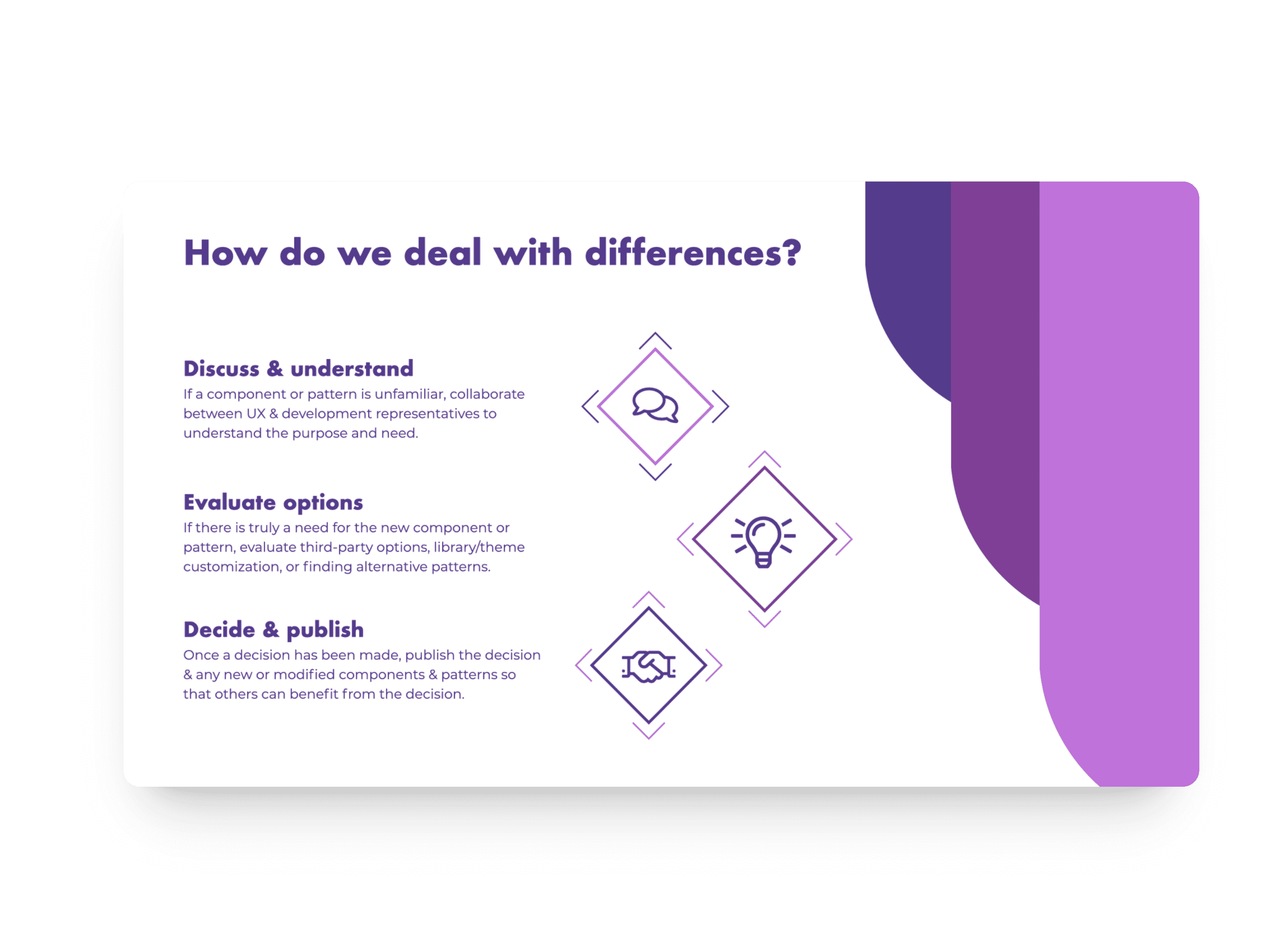

The
Foundational Pillars
The
Outcome
That volunteer effort paid off. I released Momentum 1.0 in early December, and involvement kept growing from there, eventually reaching over three dozen contributors across design and development. It became one of the most actively supported initiatives in QDivision.
By the time I handed it off, Momentum had become the foundation for every UniGroup app, along with marketing, product voice, and document templates. It cut development time for new features by a third and helped accelerate Converge's build time, directly contributing to the DOD contract win.


